
.png?fit=max&auto=format&n=fTXEPIUfjW4rC1Pi&q=85&s=85d7b852879d29ad2bde9b743307ab0e)
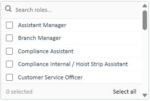
<select multiple> element. Supports live search filtering, a sticky footer with a running selected count and a “Select all” shortcut, and a dynamic exclude class for programmatic filtering.
Preview
HTML Structure & JS
updatePickerCountOnLoad()must be called in the $(document).ready block of every method that renders a picker. Without it, the footer will always display “0 selected” on load even when items are pre-checked.Search
The.picker-search bar is sticky and filters items in real time as the user types. It calls the shared platform function filterPicker(this) on every keystroke — no additional setup is required.
The search input has no name attribute and is excluded from form serialisation automatically.
Select All
The.picker-footer contains a “Select all” link that calls selectAllPicker(this). This selects every visible item in the picker (i.e. items not hidden by search or the .picker-filterout class). The footer count updates immediately.
Dynamic Filtering
Items can be hidden programmatically — independently of the search bar — by adding the.picker-filterout class. This is used when the visible set of options needs to change based on another selection on the page (e.g. hiding rooms that are not relevant to the currently selected roles).
.picker-filterout are excluded from “Select all” and do not count toward the footer badge.
.picker-filterout must be used instead of setting display:none inline so that the platform’s filter functions can detect and skip these items correctly.CSS Classes
These classes are defined in the platform’s shared stylesheet and must be present on any page that renders this component.The
.picker-footer span (used as the pickerCount element) has no dedicated class rule — it is styled via the .picker-footer span selector in the shared stylesheet. Target it with $(picker).find('.picker-footer span') in JS.