
.png?fit=max&auto=format&n=fTXEPIUfjW4rC1Pi&q=85&s=85d7b852879d29ad2bde9b743307ab0e)
Preview
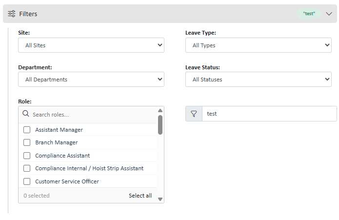
As of 29/07/2026, the accordian can be found in the app on the leave module and schedule page
HTML Structure & JS
Column Layout Logic
Filters can be distributed across two.ssFilterColumn divs or just put into the .ssFilterBody .
Filter ‘Pills’
There are filter ‘pills’ avaliable to you to display the user’s selected filters in the top accordian body.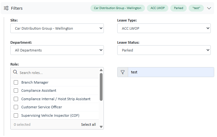
- Multi-selects
- Single Selects
- Text Inputs
- Checkboxes
ID_FilterPills and class ssFilterPillBar .
Then on any filter you’d like to appear as a pill, add ssFilterField as a class, and add a data-filter-label with the name that you’d like to appear on the pill. It must be a plural (eg. roles)
For the pills to render, you must call the global function
renderFilterPills() when you’d like them to be applied.Keyboard Shortcuts
These are active whenever the filter panel is open (i.e.#Filters_Data has the .show class).
CSS Classes
These classes are defined in the platform’s shared stylesheet and must be present on any page that renders this component.The
data-filter-label attribute on .ssFilterField is what renderFilterPills() reads to generate the pill text. Keep it short — it appears inline in the collapsed header.