> ## Documentation Index
> Fetch the complete documentation index at: https://docs.simplifi.work/llms.txt
> Use this file to discover all available pages before exploring further.
# Filter accordion
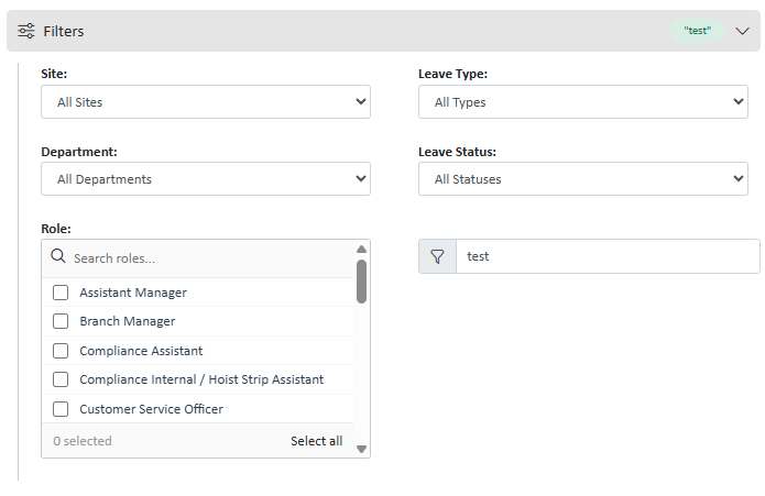
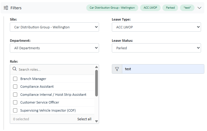
The panel collapses and expands via a Bootstrap 4.6 accordion. When collapsed, any active filter selections are shown as pills in the header row so the user can see what's applied at a glance.
***
## Preview
As of 29/07/2026, the accordian can be found in the app on the leave module and schedule page
***
## HTML Structure & JS
```html Collapsed state theme={null}
```
```javascript js theme={null}
//This is the JS that you will need to put into the method
document.querySelector(".ssFilterHeader").addEventListener("click", function () {
var expanded = this.getAttribute("aria-expanded") === "true";
this.setAttribute("aria-expanded", String(!expanded));
});
//Provides the shortcut
$(document).off("keydown.leaveFilters").on("keydown.leaveFilters", function(e) {
if (!$("#Filters_Data").hasClass("show")) return;
if (e.key === "Escape") {
if (e.target.tagName === "SELECT") e.preventDefault();
clearFilters();
}
});
//If you filters that are applied by default, you should
//always call renderFilterPills() on load
$(document).ready(function() {
renderFilterPills();
});
```
***
## Column Layout Logic
Filters can be distributed across two `.ssFilterColumn` divs or just put into the `.ssFilterBody` .
```css theme={null}
.ssFilterBody {
margin-top: 10px;
border-top: none;
border-left: 1px solid rgb(204, 204, 204);
margin-left: 10px;
padding-left: 20px;
display: flex;
align-items: flex-start;
gap: 32px;
flex-wrap: wrap;
}
.ssFilterColumn {
display: flex;
flex-direction: column;
flex: 1;
min-width: 220px;
width: 300px;
}
```
***
## Filter 'Pills'
There are filter 'pills' avaliable to you to display the user's selected filters in the top accordian body.
Currently, the input types supported are:
* Multi-selects
* Single Selects
* Text Inputs
* Checkboxes
To enable pills on the accordion,
```html focus={6} theme={null}
```
Add a span element with the id= `ID_FilterPills` and class `ssFilterPillBar` .
Then on any filter you'd like to appear as a pill, add `ssFilterField `as a class, and add a `data-filter-label` with the name that you'd like to appear on the pill. It must be a plural (eg. roles)
```html focus={1} theme={null}
Leave Status:
```
The class and label can sit on either a div wrapping the select/input on on the select/input element itself.
For the pills to render, you **must** call the global function `renderFilterPills()` when you'd like them to be applied.
***
## Keyboard Shortcuts
These are active whenever the filter panel is open (i.e. `#Filters_Data` has the `.show` class).
| Key | Action |
| :------- | :------------ |
| `Escape` | Clear filters |
Escape calls `e.preventDefault()` when the focused element is a `
***
## CSS Classes
These classes are defined in the platform's shared stylesheet and must be present on any page that renders this component.
| Class | Element | Purpose |
| :----------------- | :--------- | :---------------------------------------------------------------------------------------------------------------------------------- |
| `.ssPanel` | `div` | Bordered, lightly shadowed container for the full accordion |
| `.ssFilterHeader` | `button` | Full-width clickable trigger row; holds icon, title, pills, and arrow |
| `.ssFilterTitle` | `span` | Takes up remaining flex space between the icon and the pill bar |
| `.ssFilterPillBar` | `span` | Flex container written to by `renderFilterPills()` |
| `.ssFilterArrow` | `i` (icon) | Rotates 90° via CSS transition when hovered over |
| `.ssFilterBody` | `div` | Flex row containing the two filter columns |
| `.ssFilterColumn` | `div` | Left or right column (`flex: 1`) |
| `.ssFilterField` | `div` | Wraps a single label + control. The `data-filter-label` attribute is used as the pill text when this field has a non-default value. |
The `data-filter-label` attribute on `.ssFilterField` is what `renderFilterPills()` reads to generate the pill text. Keep it short — it appears inline in the collapsed header.
 Currently, the input types supported are:
* Multi-selects
* Single Selects
* Text Inputs
* Checkboxes
To enable pills on the accordion,
```html focus={6} theme={null}
```
Add a span element with the id= `ID_FilterPills` and class `ssFilterPillBar` .
Then on any filter you'd like to appear as a pill, add `ssFilterField `as a class, and add a `data-filter-label` with the name that you'd like to appear on the pill. It must be a plural (eg. roles)
```html focus={1} theme={null}
Currently, the input types supported are:
* Multi-selects
* Single Selects
* Text Inputs
* Checkboxes
To enable pills on the accordion,
```html focus={6} theme={null}
```
Add a span element with the id= `ID_FilterPills` and class `ssFilterPillBar` .
Then on any filter you'd like to appear as a pill, add `ssFilterField `as a class, and add a `data-filter-label` with the name that you'd like to appear on the pill. It must be a plural (eg. roles)
```html focus={1} theme={null}